A wholesaler nobody outside the trade had heard of, selling through 1,200 agencies.
The problem was not the logo
airtuerk sells flights to travel agencies, not to travellers. That sounds like it removes the need for a brand. It does the opposite. When your customer is an agent choosing between four consolidators on price and availability, the only things that separate you are how easy you are to work with and how confident the agent feels recommending you.
Neither of those lives in a logo. Both live in the booking flow.
Two jobs, one system
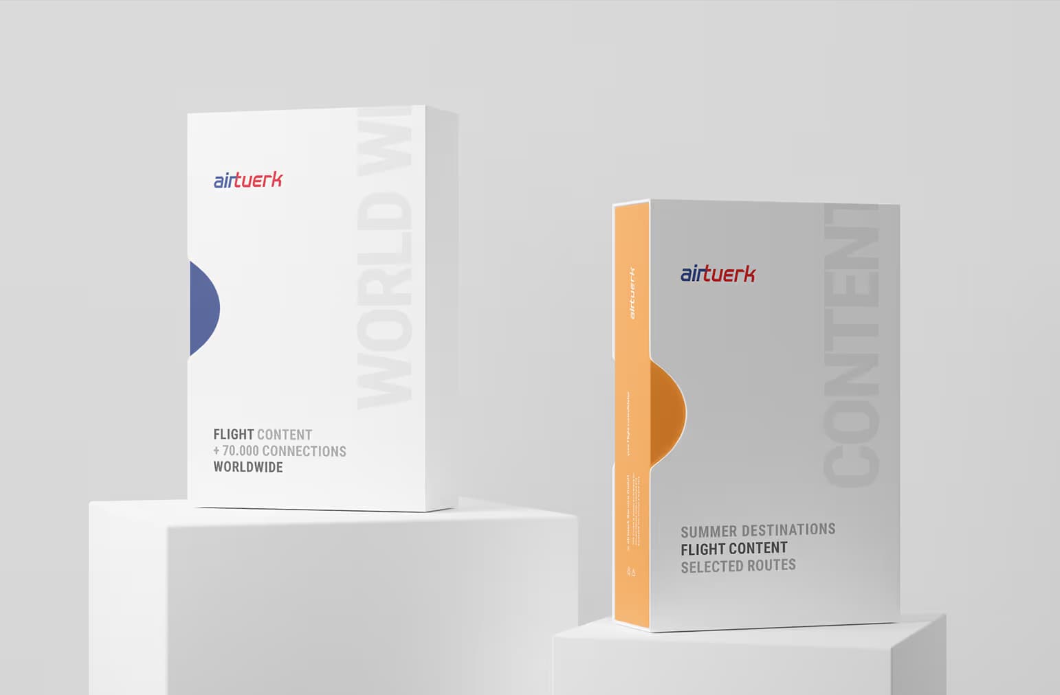
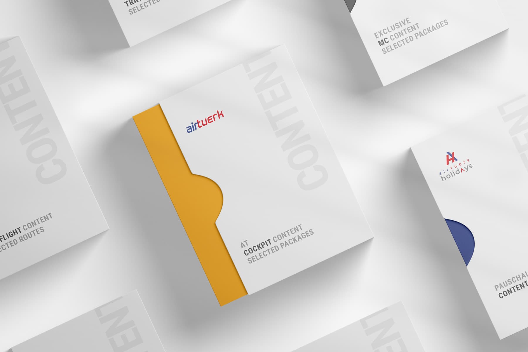
The corporate identity came first because everything else hangs off it. New wordmark, colour system with a single accent, typographic scale, rules for how the group brands relate to each other. Not a style guide as a PDF that nobody opens, but a design system with components.
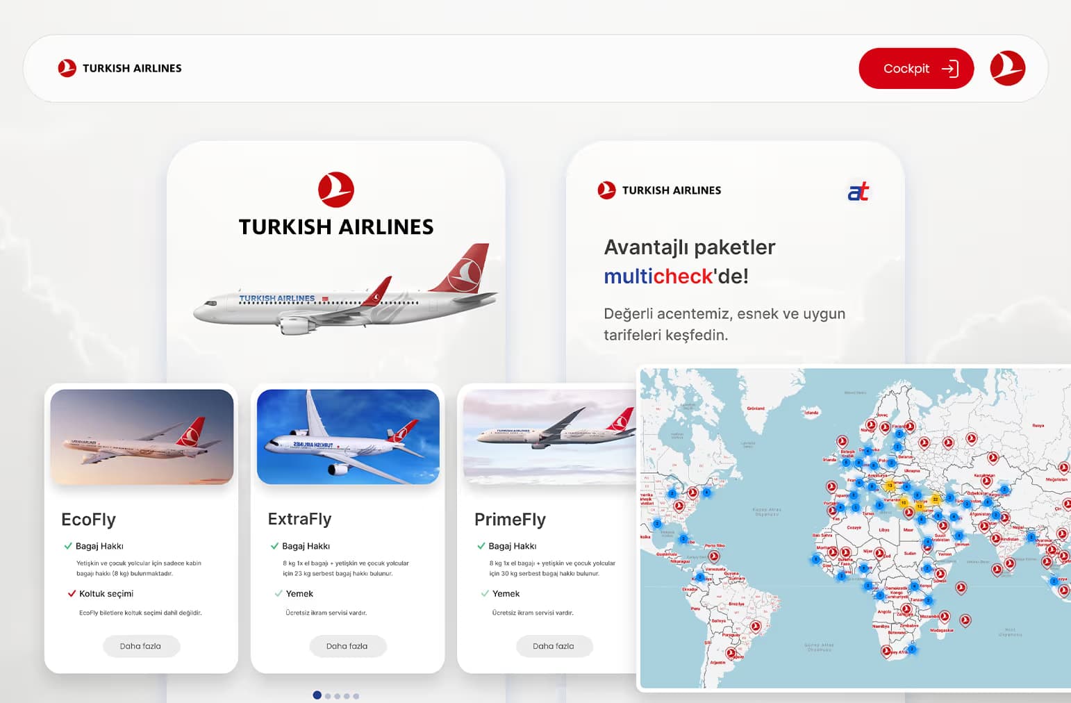
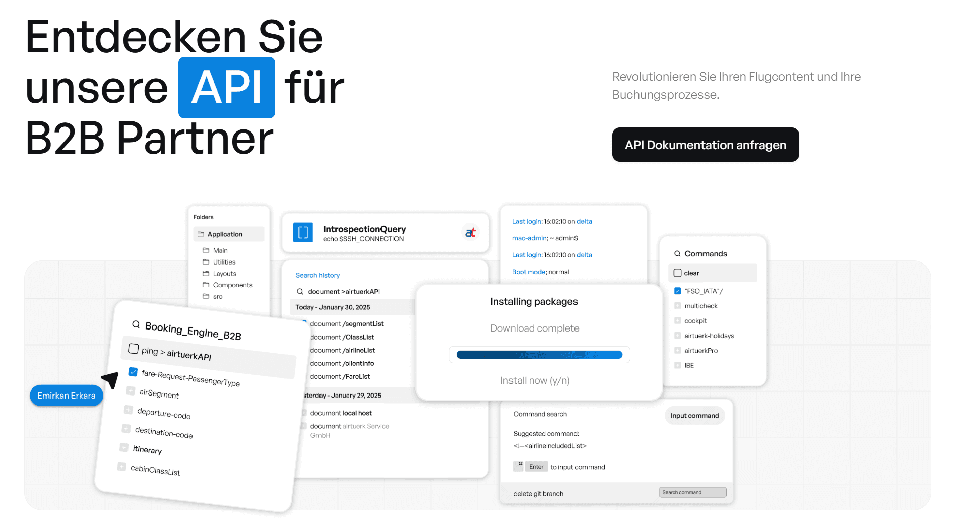
Then the booking portal. The IBE is where an agent spends their working day, and its interface had grown by accretion. The rework was about removing steps, not adding features: fewer screens between search and confirmation, clearer fare rules, states that tell an agent what is happening instead of leaving them guessing.
The UI design system was built with Emirkan Erkara, lead product designer, whose own account of the work is at emirkanerkara.com.
What it changed
The brand became legible to partners. The booking flow became shorter. Both matter, but the second one is measurable and the first one is not, which is worth being honest about.
What I would do differently
I built the design system before the booking flow, on the assumption that identity should lead. In hindsight the interface work would have sharpened the system rather than inherited it. Design systems built from real screens survive; design systems built from principles get amended within a year.