The longest relationship on this page, and the one that taught me the most about systems.
Seven years is the actual test
Any designer can make a company look good once. The question that only shows up later is whether the thing still holds when the company has grown, added entities, entered new markets and hired people who were not in the room when the rules were made.
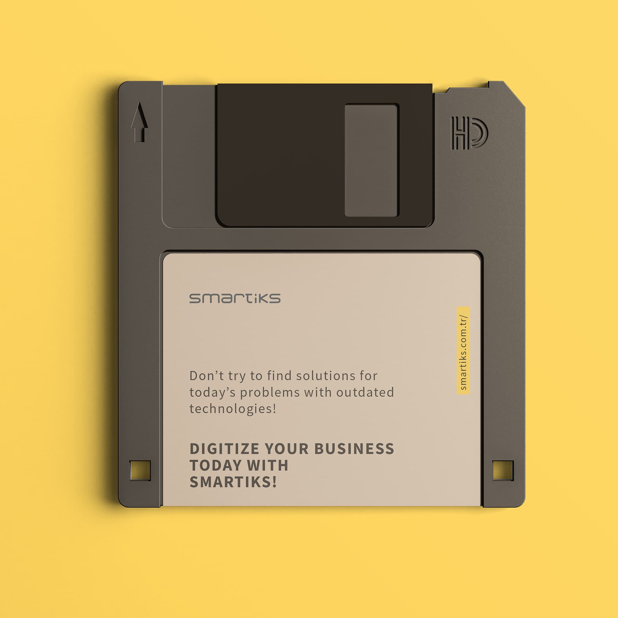
Smartiks builds data warehousing, integration, reporting and dashboards for enterprise customers. Their communication has to work for investors, enterprise buyers and technical evaluators at once, across a multi-company structure and in more than one country.

What that requires
Not a style guide. A system: modular layouts, a clear hierarchy that survives translation, templates that a marketing person can use without asking a designer, and components that still look intentional when combined in ways nobody anticipated.
Stationery and investor documents. UX for the product side. Social assets. The website. All of it from the same set of parts, so that a document produced in Istanbul and a page produced elsewhere are recognisably the same company.

The part that is newer
More recently the same question applies to machines. Whether a page can be read, quoted and summarised correctly by an answer engine is now a communication requirement, not a technical afterthought. It turns out to reward the same things good design always did: clear structure, unambiguous hierarchy, saying what you mean near the top.
What I would tell a younger version of myself
That the interesting constraint is not the first design, it is the tenth person who uses it without instructions. Build for them, and the first design takes care of itself.