The brief was a place to download logos
That was the whole task. Colleagues needed somewhere to find the logo files. Team photos, templates, presentations, email signatures. A brand hub, nothing more.
While building it I noticed I was solving the wrong problem. The logos were not the thing that was scattered. Everything was. Documents with one vendor, contracts with a second, company knowledge in a Confluence instance run by an external partner, deadlines and birthdays in yet another system. Five contracts, five logins, five invoices, nothing connected.
I finished the logo folder anyway. It became the first building block.
Why I built it myself
Off-the-shelf software did not fit the way a flight consolidator actually works, and what would have fit was too expensive.
But the reason that decided it came before price. Anyone who does not know our processes has to have them explained, and what gets explained is how they work on paper, not how they run. An external vendor would have spent months understanding how ticketing, service centre and finance connect here, and would then have built what was said in the meetings.
I have been in the building for four years. I did not need to find out where it hurts. I knew. That was the head start, not the technology.
The bottleneck was never engineering. It was domain knowledge.
Replaced
| Before | Now |
|---|---|
| External document management | in-house |
| External contract management | in-house |
| Shift planning by hand | AI-assisted |
| Confluence via an external partner | own retrieval model |
| External reminder and event systems | integrated |
| Brand assets scattered across drives | brand hub |
One surface, eight modules
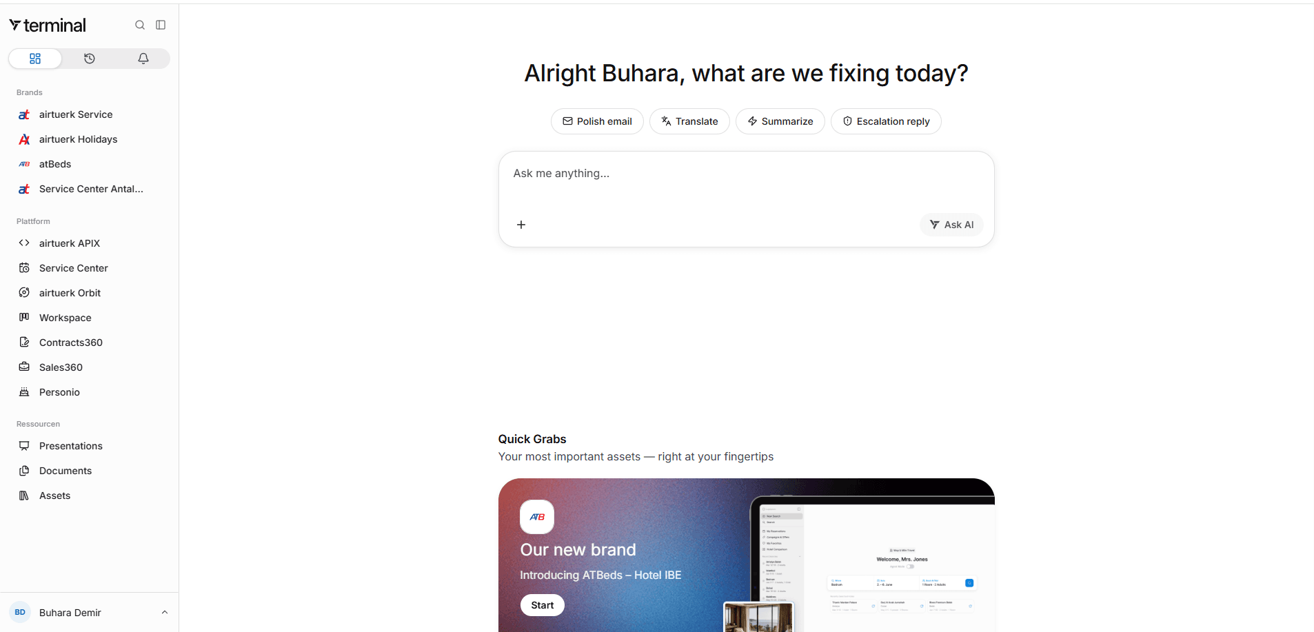
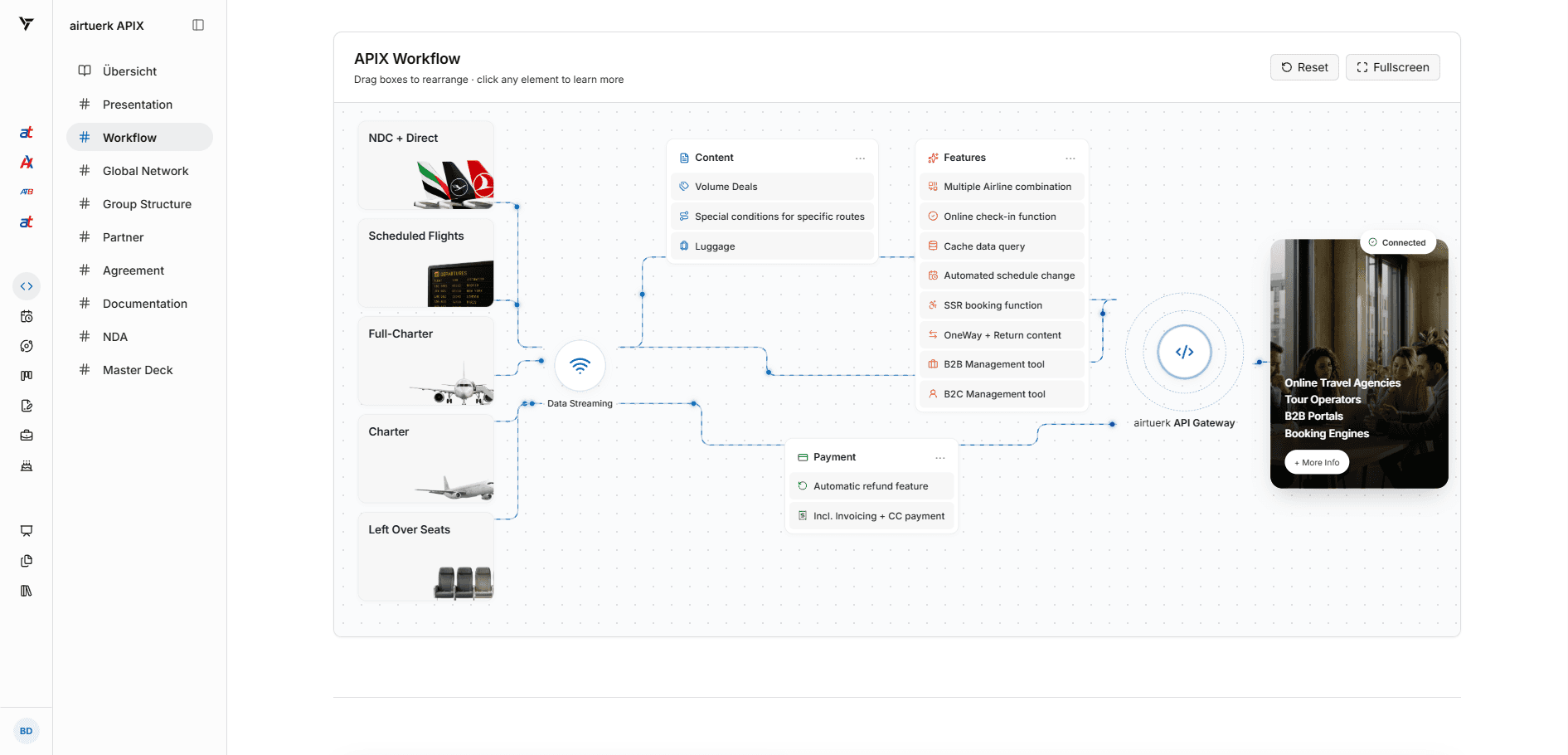
Four brands and three legal entities across Germany and Turkey sit in the same navigation. HR, sales, contracts, tasks, service centre, the partner API portal and the knowledge base share one role and permission model.
The home screen asks what you are fixing today. Retrieval is one capability among several, not the identity of the product.
Reading contracts without pretending to be certain
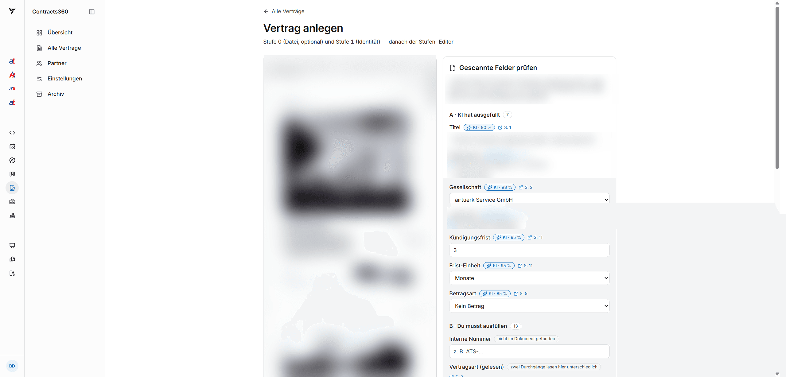
Contracts360 scans an uploaded agreement and fills the fields it can. The interesting decisions are not in the extraction. They are in what the interface admits.
- Every extracted value carries a confidence figure and a page reference, so a value can be checked in two clicks
- Fields split into what the model filled and what a human still has to enter, and the counts are shown
- Every document is read twice. Where the two passes disagree, the interface says so instead of picking a winner
- Nothing counts as verified until a person confirms it, and the copy says that in plain language
An assistant that hides its uncertainty is worse than no assistant.
A design system, not a theme
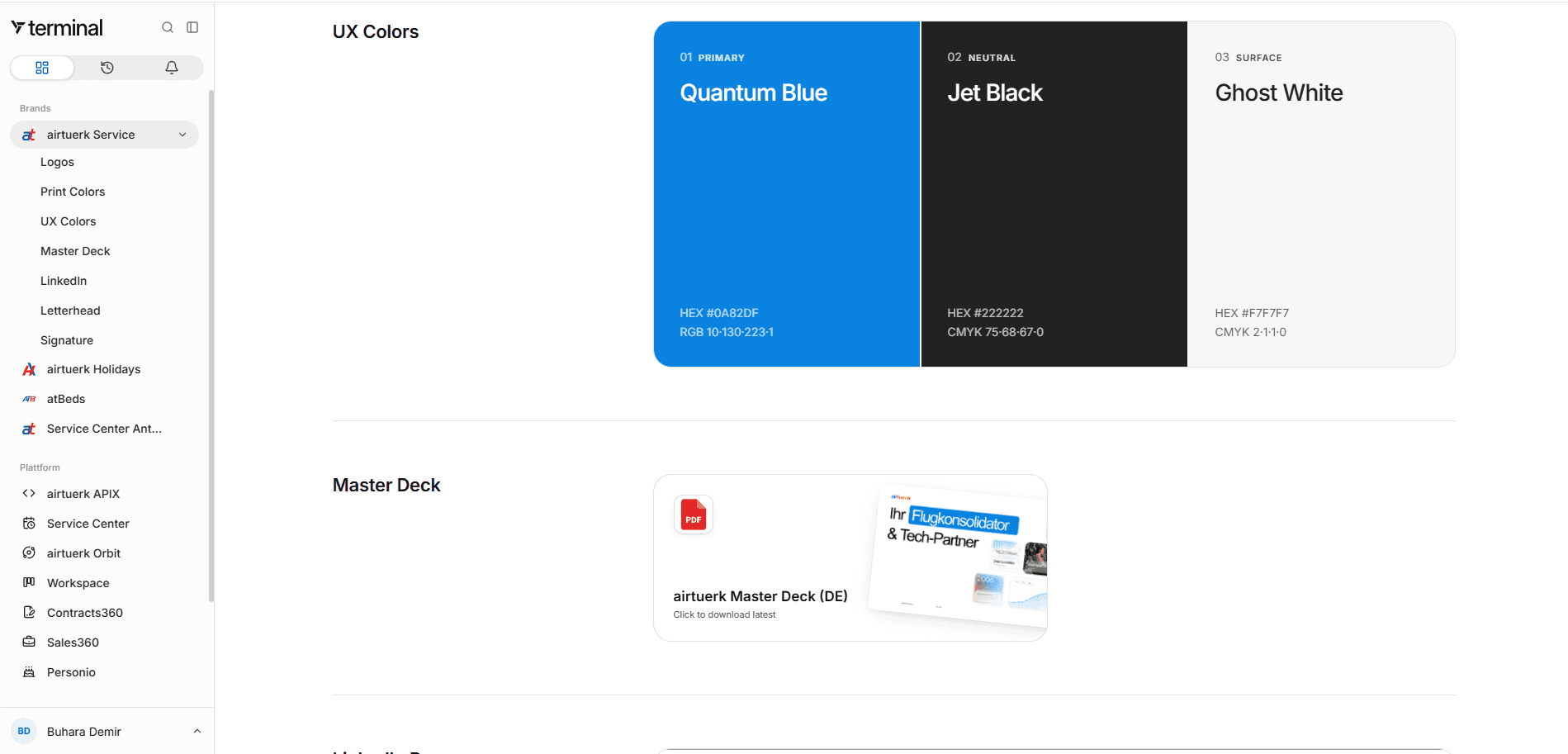
terminal is light only, flat, editorial. One typeface, one accent, no component library, no glassmorphism. Interactive elements are hand-rolled, which is slower at the start and much faster after the tenth screen.
The design system lives inside the product, so the people who use the brand can reach it without asking anyone.
Numbers
| 70 | colleagues working in it daily |
| 5 | external vendors replaced |
| 3 | legal entities, two countries |
| 8 | modules under one permission model |
| ~94 | tables, row-level security throughout |
| 1 | person building and operating it |
Shipping alone without breaking things
One person running a production system for seventy people works because of process, not heroics: reconnaissance before building, a second instance that plans and verifies what the first one executes, an explicit go from a named owner before anything touches live data. The full method is in shipping alone without breaking things.
What did not happen is part of the result. No alignment rounds with a vendor, no ticket ping pong, no sprints nobody wants to attend. When a requirement appeared, I built it. When it turned out to be wrong, I threw it away. There was never a calendar entry between the problem and the fix.
Next
Sales, with the full data model and the management flow attached. After that the path from enquiry to invoice runs inside the same system that holds knowledge, contracts and planning.
Internal system. The login screen is as far as it goes from the outside.